Branding
All necessary information connection with the unified brand
Color Palette
The color palette of is meant to give a reference to identify the primary and the variants of colors to use in marketing campaigns in order to maximize the impact of the brand.
It includes specific spot colour references for RGB & Hexadecimal for presentation software, web applications and emitted lighting. Also included are PMS & CMYK equivalents for printing applications.
The PRIMARY ones are the core colors of Layer: their use defines and reinforces our distinctive character, and should be used on all communica-tion materials.
The SECONDARY ones are designed to support and complement the primary, by enabling flexibility and variety in design.
Numbers may differ to the way inks appear on different stock papers and or other surfaces (e.g. walls), as there will never be perfect matching between RGB & print.
Primary
-
Web#028EA0 (2, 142, 160, 1)
-
Print(62 / 7 / 0 / 37)
-
Pantone(Blue 7711 C)
-
Web#FFFFFF
(255, 255, 255, 1) -
Print(0 / 0 / 0 / 0)
-
Pantone(White)
-
Web#028EA0 (2, 142, 160, 1)
-
Print(62 / 7 / 0 / 37)
-
Pantone(Blue 7711 C)
Secondary
-
Web#1B99AA
(27, 153, 170, 1) -
Print(84 / 10 / 0 / 33)
-
Pantone(Blue 2222 C)
-
Web#FCFCFC
(252, 252, 252, 1) -
Print(0 / 0 / 0 / 1)
-
Pantone(White)
-
Web#292929 (41, 41, 41, 1)
-
Print(0 / 0 / 0 / 84)
-
Pantone(Black C)
-
Web#269EAD
(38, 158, 173, 1) -
Print(78 / 8 / 0 / 32)
-
Pantone(Blue 2235 C)
-
Web#FAFAFA
(250, 250, 250, 1) -
Print(0 / 0 / 0 / 2)
-
Pantone(White)
-
Web#262626 (38, 38, 38, 1)
-
Print(0 / 0 / 0 / 85)
-
Pantone(Neutral Black C)
Corporate Logo
Definition
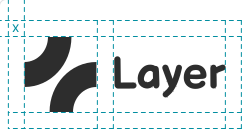
The Layer logo is the main element in Layer’s corporate Identity and is used to represent the company in all communications.
It is composed by 2 part:the main typography (1) and the slogan (2).
The only exception to be made is when it has to be resized ad a width that is less than 30mm or 140px, as the slogan becomes unreadable: in such a case use only the main typography only logo (THIS APPLIES TO BOTH GRADIENT AND FLAT LOGO VERSIONS).
The minimum size at which the main typography only logo, no matter the color version, can be used is 20mm / 50px.
Also, everytime you use it there should always be clear space around it, in the size of the typography heading as described on the right.
Last, when resizing always keep the same proportion. Do not stretch it to increase width or height: both should always be 100%.
Each part of the logo may not be used independently in a document or any graphic mockup.
-
-
Layer
main typography only
(use it at less than 36mm / 137px -
 Layer
Layer
minimum size: 13mm / 50px
Bright Gradient Usage
The “BRIGHT” version of the Layer logo should always be used in combo with a very dark background.
In general, the Layer brand should always be perceived clearly, and the slogan has always to be readable.
With the “BRIGHT” version just avoid white or very bright backgrounds; also it is not recom-mended to use it on any noisy background, not even by adding an outline to make it more catchy.
If you only have a bright background then you might want to use the “DARK” version of the logo, that is depicted in the following pages.
There should always be a nice contrast between the logo and the background.
Dark Gradient Usage
The “DARK” version of the Layer logo should always be used in combo with a very bright background.
In general, the Layer brand should always be perceived clearly, and the slogan has always to be readable.
With the “DARK” version just avoid black or very dark backgrounds; also it is not
recommended to use it on any noisy background, not even by adding an outline to make it more catchy.
There should always be a nice contrast between the logo and the background.
Typography
Layer uses a typeface from Google web fonts for all its corporate and communications assets
The bold version is used mainly for headlines or slogans that need to capture the attention of those who are exposed to it, always in capital letters.
The regular one is used for all paragraph parts instead. Make sure you modify heading and also the kerning when lowering the size: the text should always be readable and a general sense of elegance should be perceived.
Reference for the fonts:
https://fonts.google.com/
Balsamiq Sans
Inter
abcdefghijklmnopqrstuvwxyz
1234567890
abcdefghijklmnopqrstuvwxyz
1234567890